Hungry. Honest. Hardworking.
Unique. Unafraid. Unbeatable.
Bold. Brave. Brilliant.
These are the words that were thrown around our boardroom when we were spit balling the new HUB brand. After months of discovery and design, fleshing out the concept, tweaking it and then perfecting it, we think our new brand fits us to a tee. But why the drastic change?
The old HUB was too demure. Too subtle. Too conventional. It didn’t embody the agency we are today.
The new HUB is confident. Striking. Self-assured.
So how did we craft this brilliant new brand, you ask? It all started with a call on our design team. We asked them to create a visual brand identity that they thought best conveyed the agency they live and breathe.
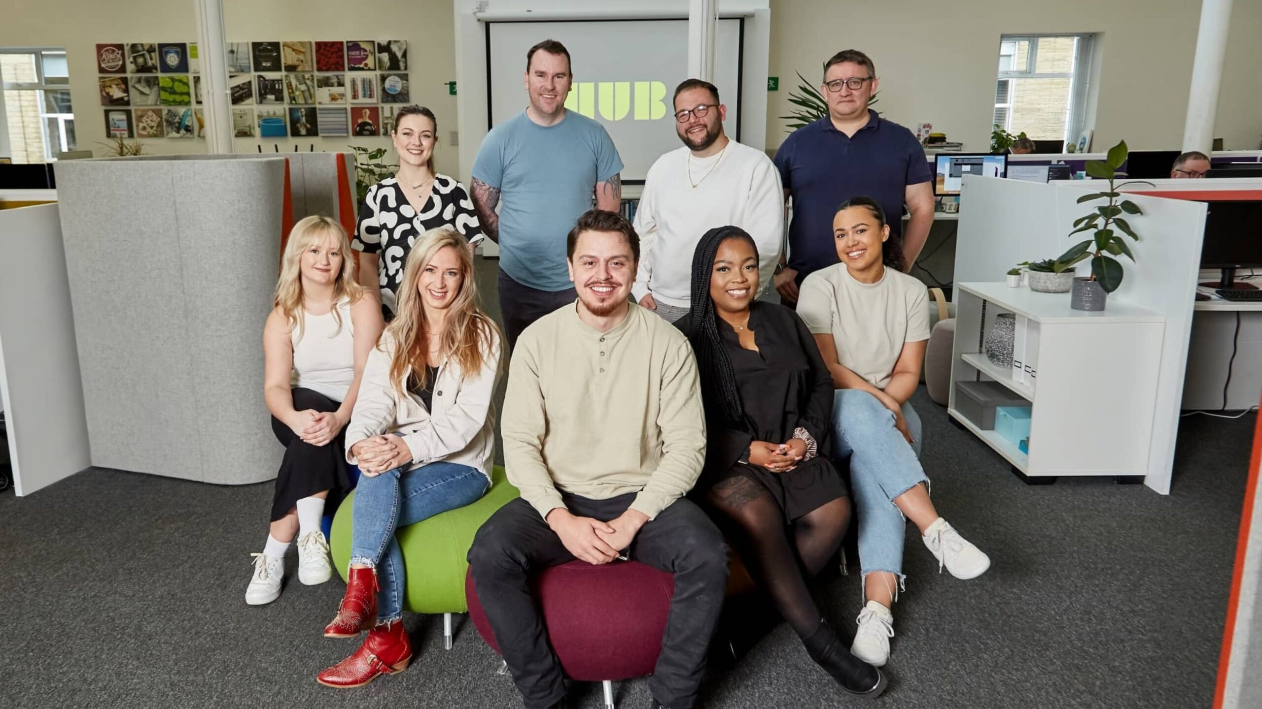
The new HUB brand is a mixture of three fantastic designers, Pete Bucktrout, Jen Appleton and Nina Ricks, Copywriter Beth Gordon, and Marketing Manager Abbie Harrop.
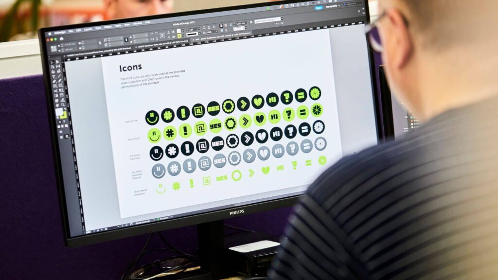
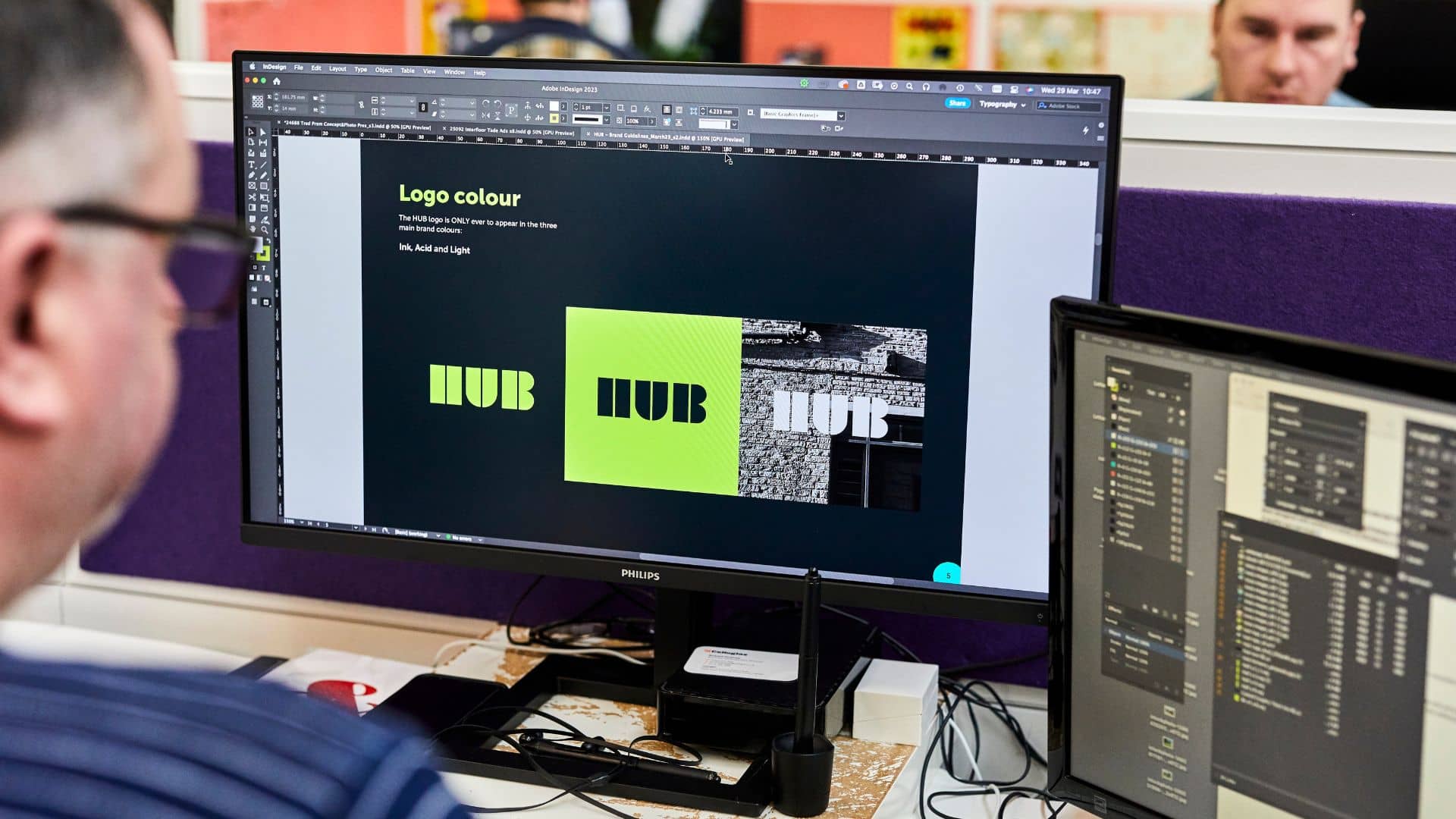
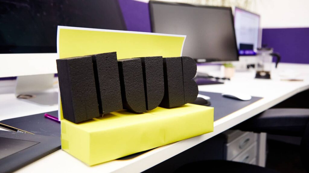
Pete’s logo is the perfect transformation from HUB’s old identity. The evolution from lowercase to uppercase felt like a natural progression, and we loved the idea of the new logo being a stamp. It says, ‘We’re here. This is who we are. And we’re going to make waves.’
Once we’d fleshed out the brand guidelines, finetuning graphics and cherry-picking secondary colours, it was time to move on to the brand identity as a whole.
‘We are insight and data driven. Performance led. We don’t have a strapline. We simply have a direct and confident tone of voice.’
This was the bold statement written by Nina when she pitched her design for the new HUB brand. We loved it. We loved its no-frills approach, its determination, and its tenacity.
Beth and Abbie used this statement to home in on HUB’s tone of voice and presented a concept that simply fit with the new HUB brand. We didn’t want to sound like any other agency. We wanted to be confident, but never arrogant. Most importantly, we wanted to be approachable. Friendly.
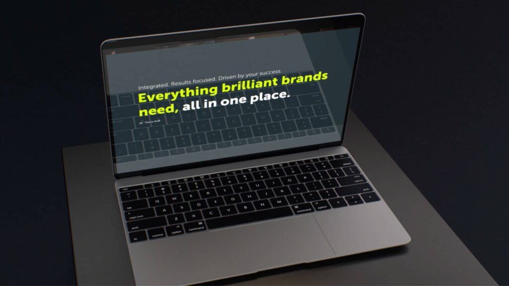
From there, we could finally set to work on the centrepiece of the new HUB brand – our slick new website.
Jen was more than happy to get her teeth stuck into such a meaty project. From the homepage to case studies layout to service page design, it’s all thanks to Jen. Her keen eye for UX combined with her unique style of design resulted in a website that perfectly resonates with the new HUB identity.
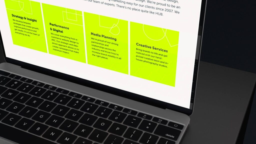
The team set to work designing beautiful new case studies, and our strategy team undertook a deep-dive into our extensive list of services – finalising the list at a whopping 14 offerings.
All that was left to do was to make sure the new brand launched with a bang – and what better way than with a (literally) hard-hitting showreel? Nina and Josh Broadhead crafted a spectacular new showreel which showcased some of HUB’s recent work that we’re most proud of – all to a unique soundtrack from Mark Hadfield, producer of Ne-Yo’s number one hit ‘Let Me Love You.’
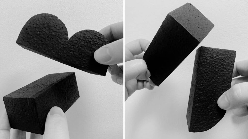
The showreel also featured captivating snippets of the new HUB logo being forged. The full-length ident encapsulates everything our new brand is. Acidic. Tactile. Solid. It exhibits the journey we’ve been on to get to where we are.
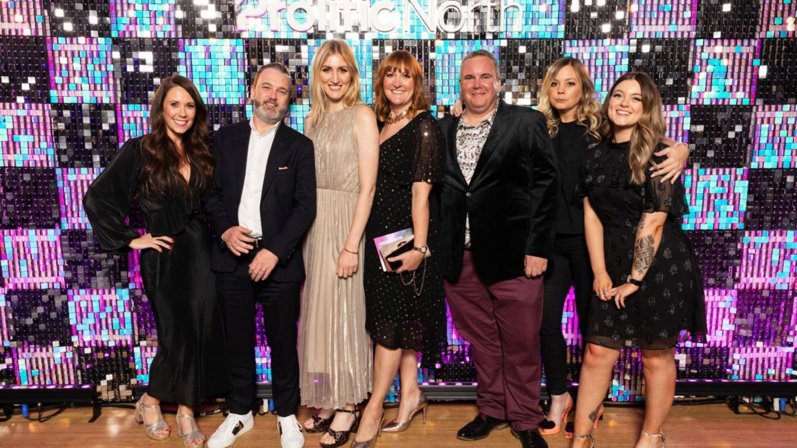
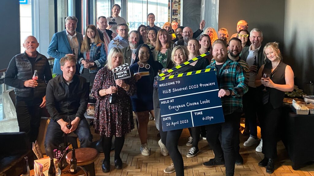
We premiered the showreel to the HUB team on 26th April, a private screening at the Everyman Cinema in Leeds. The website went live on 18th May. And we dropped the showreel to socials the following week.
So, what does the HUB team think of the new brand?
“It’s confident and truly reflects who we are.” – Chris Hudson, Co-founder and Chairman
“Vibrant, bold and confident. I also want to say how wowed I am with how everyone pulled together as a team to deliver this so quickly and with the least amount of strain I’ve ever seen on a project! A true collaboration of skills, personalities, newbies and long timers.“ – Sam Yaffe, Digital Manager
“I love the new site, well done everyone who was involved!” – Csaba Guj, Senior Front-End Developer
“To me the new branding looks very exciting and editorial, and makes me very proud to shout about working here. Our new logo uses simple shapes as building blocks to make up something much greater – much like the work we produce for our clients.” – Daniel Georgiev, Digital Designer
“The new brand is modern and eye-catching.” – Suzanne Doherty, Finance Manager
“I never get bored of watching the showreel. They’re normally a bit cringey but ours is absolutely amazing, Nina and Josh totally smashed it.” – Paul Duroe, Artwork & Repro Operator
“Slick, exciting and creative.” – Carrie Barrett, Paid Social Media Manager
“Attention grabbing, to the point, and conveys the spirit of HUB.” – David Corbet, Account Manager