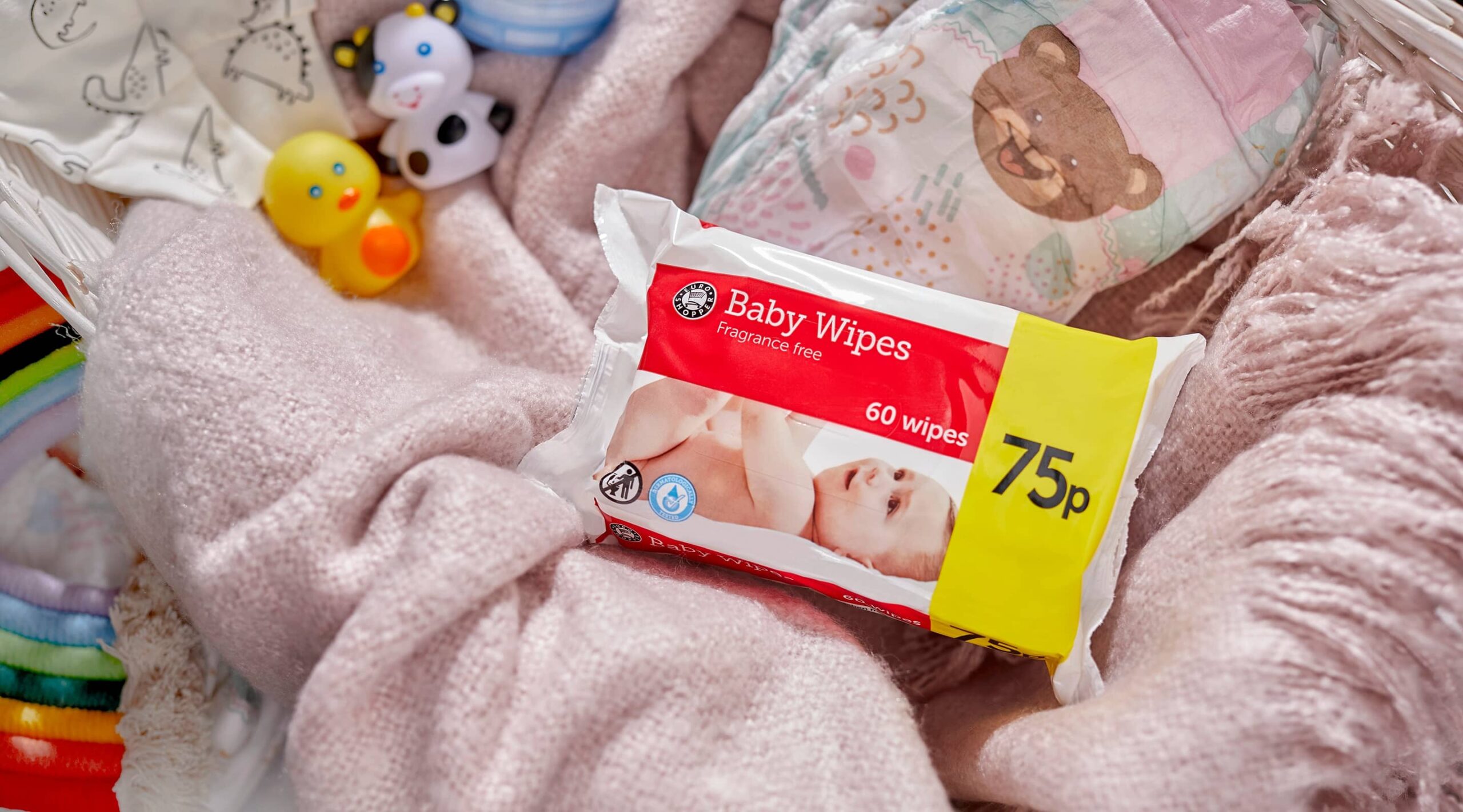
Euro Shopper’s red and yellow packaging is iconic – but with big brands challenging own-label products with aggressive discounts and promotions, Euro Shopper needed a fresh new look to boost its shelf appeal.
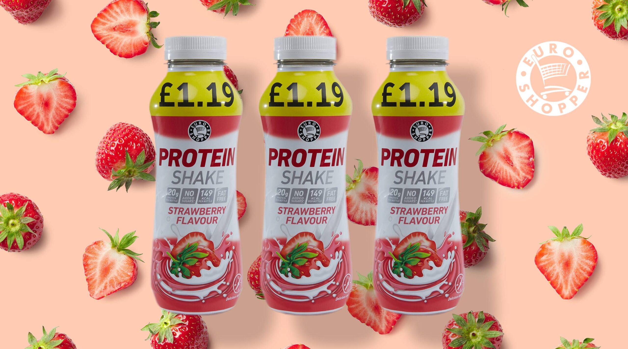

Euro Shopper
Euro Shopper is the leading convenience brand in the UK. Out of milk? In need of a quick chocolate fix? Chances are you'll pop to your local Premier, Budgens or Londis and snap up a Euro Shopper product.
Service
Packaging Services, Brand Development & DesignSector
Beauty, Food & Drink, Home & Garden, Retail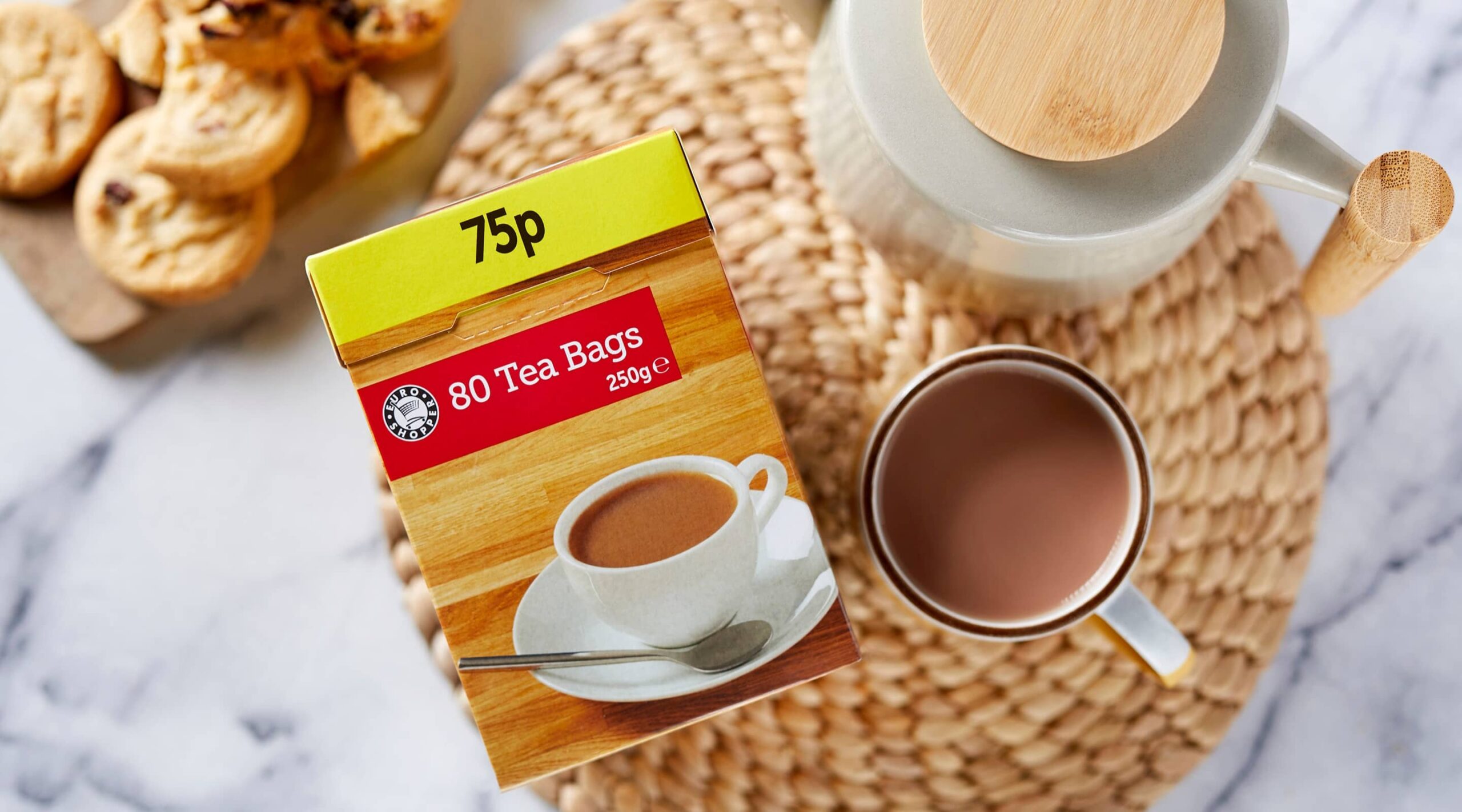
Challenge
Euro Shopper’s red and yellow packaging is iconic – but with big brands challenging own-label products with aggressive discounts and promotions, Euro Shopper needed a fresh new look to boost its shelf appeal.
The new packaging needed to:
Solution
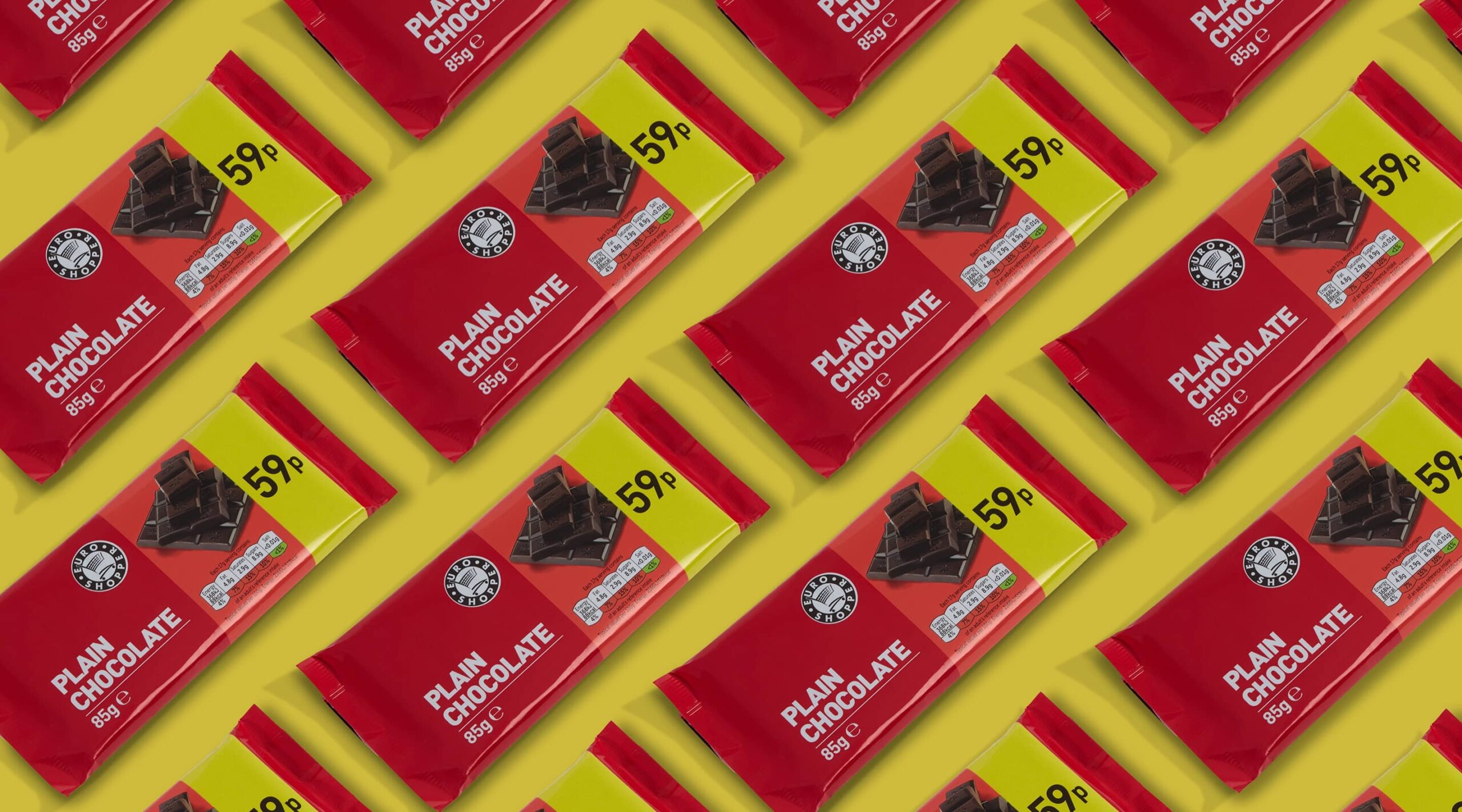
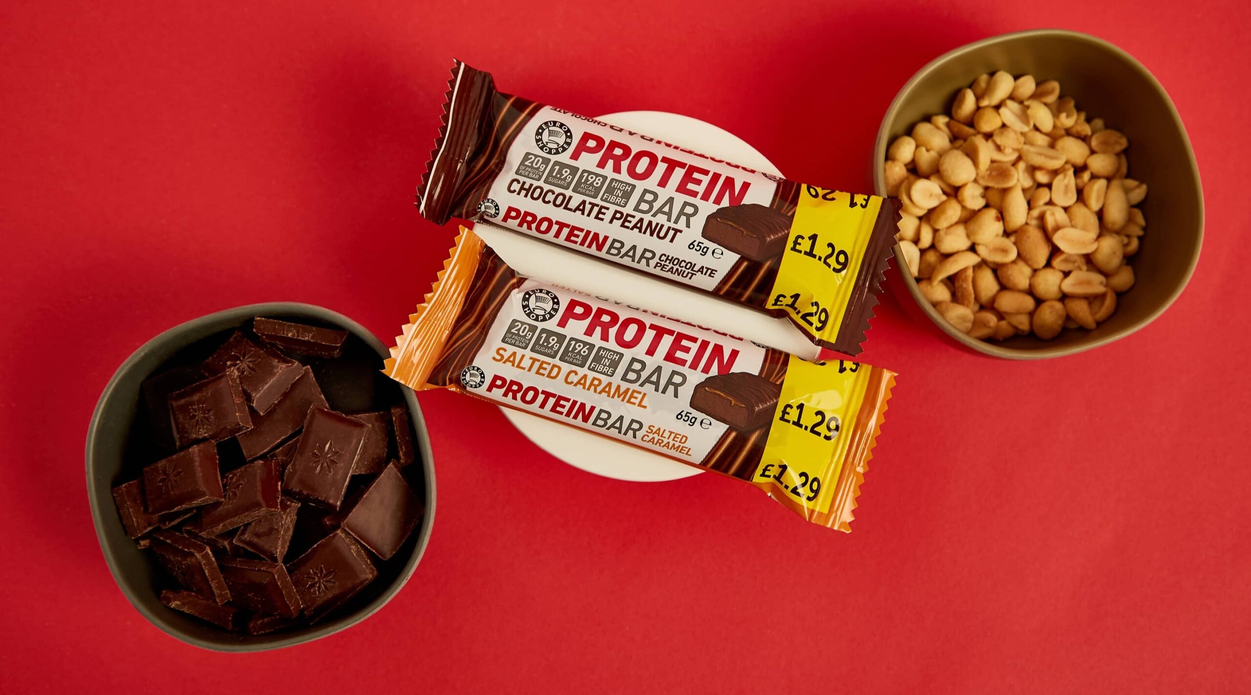
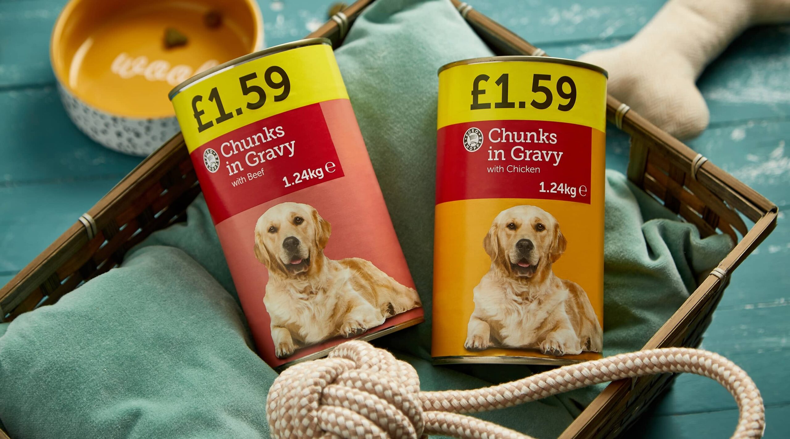
The results of our customer research were clear. Euro Shopper’s customers would be influenced by packaging that was striking, legible and relatable. So that’s where we started.
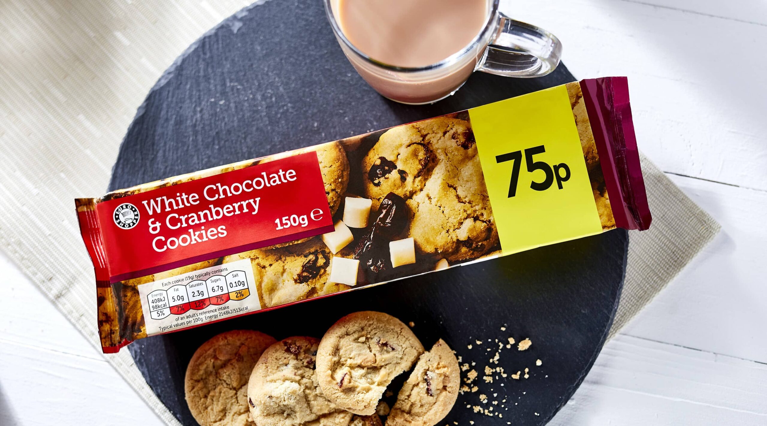
We replaced block capitals with contemporary typography to maximise space and enhance readability. Our in-house photography team used actual Euro Shopper products to capture eye-catching images which would boost customer confidence. And our fantastic repro team made sure the colours stayed vibrant whilst sticking to our client’s print budget.
Results
Euro Shopper’s new packaging delivered everything our client wanted it to. It boosted customer confidence in the quality of Euro Shopper’s products and the improved navigation of on-pack information. Most importantly, Euro Shopper’s products now stand out against competitor products on the same shelf.
